Since I may be looking to create covers for my own epic fantasy novels, I am curious what sort of cover the top sellers use, and which my friends prefer. To make the choice easy and define the conversation, I’ve identified four main categories in top-selling fantasy novels:
1: The Definitive Character Close-up
2: The Open-ended Character Silhouette / Back View 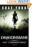
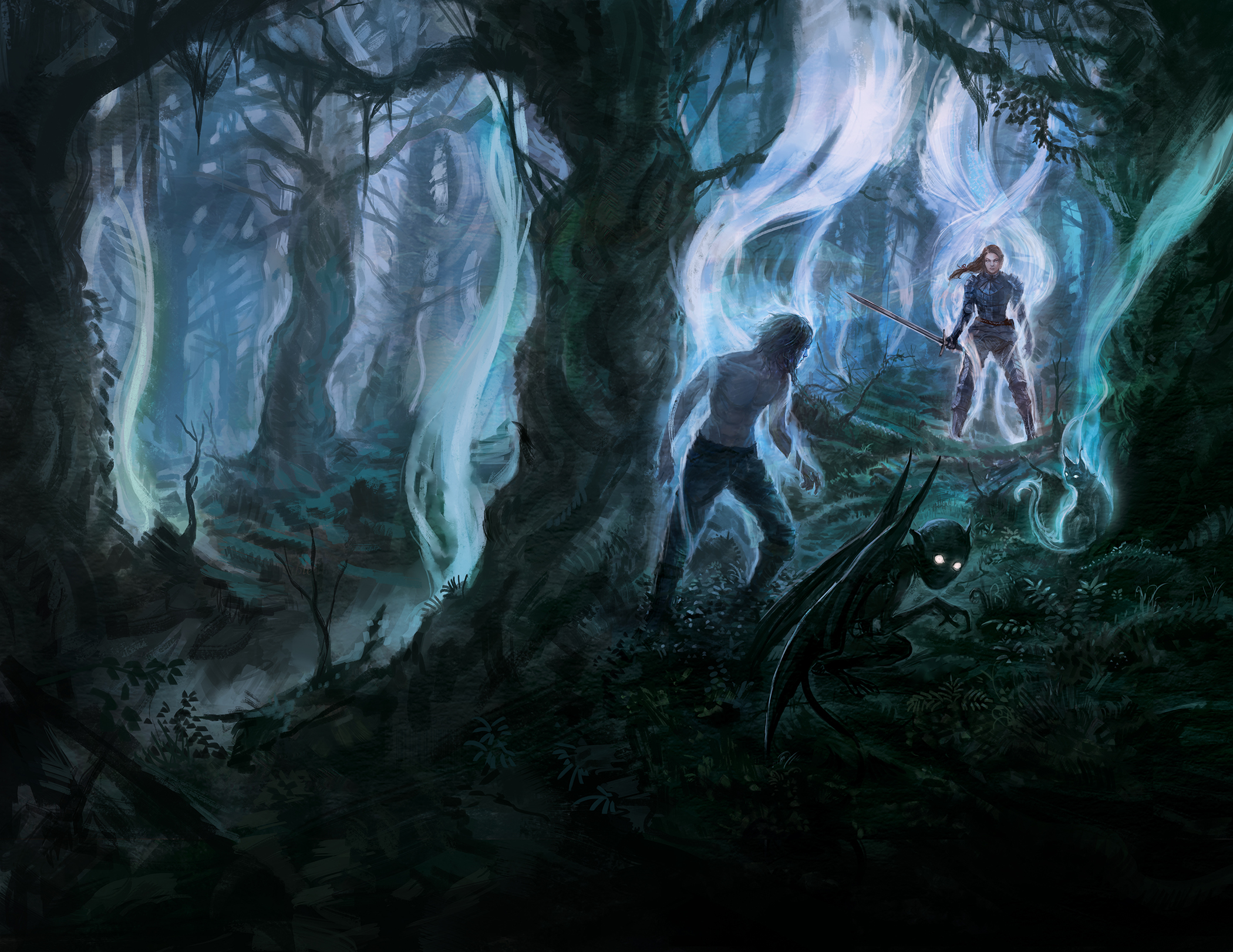
3: Otherworldly Landscape w/ Optional Foreground Figure
4: The Fantasy Icon
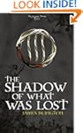
And below I’ve assembled a collection of thumbnails for each category. (Most of these I gleaned from Amazon’s top 30 epic fantasies — the ones with the “Look Inside” graphic. Those without the graphic are from B & N and Kobo.)
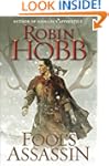
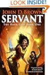
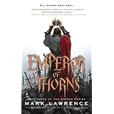
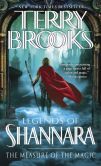
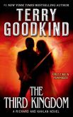
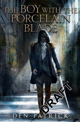
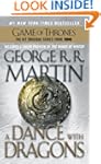
1 – DEFINITIVE CHARACTER SHOT (single figure, close-up to medium shot)


PROS & CONS
+ clear, definitive view of character
+ simple and uncluttered (good for thumbnail)
+ can include action and dramatic hooks
– leaves little of character’s appearance to imagination
– defines race*
*I suspect covers that don’t define the race of the main character–that leave race ambiguous–may appeal to a wider readership.
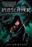
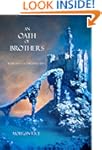
2) OPEN-ENDED CHARACTER SILHOUETTE OR BACK VIEW (medium shot)
")


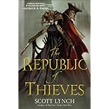
PROS & CONS
+ some setting, fairly simple, high contrast good for thumbnail
+ leaves character appearance and race to imagination
+ can have action and dramatic hooks
– absence of face / fewer details of appearance may provide fewer emotional hooks
3) OTHERWORLDLY LANDSCAPE (long shot, optional lonely figure(s) in foreground)

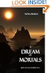

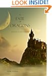


PROS & CONS
+ inspires dreams of fantasy setting, defines nothing of character appearance
– provides no emotional hook via characters, action or drama
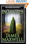
4) ICON COVER (thematic emblem only )


PROS & CONS
+ defines nothing of character appearance or even setting — the true black box cover
– provides no emotional hook via characters, action, drama, or setting
HAVE THOUGHTS ON THIS?
Leave a comment below! : )