

Since I may be looking to create covers for my own epic fantasy novels, I am curious what sort of cover the top sellers use, and which my friends prefer. To make the choice easy and define the conversation, I’ve identified four main categories in top-selling fantasy novels:
1: The Definitive Character Close-up
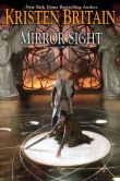
2: The Open-ended Character Silhouette / Back View ![]()
![]()
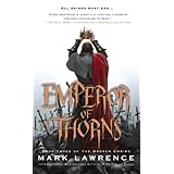
3: Otherworldly Landscape w/ Optional Foreground Figure
4: The Fantasy Icon
And below I’ve assembled a collection of thumbnails for each category. (Most of these I gleaned from Amazon’s top 30 epic fantasies — the ones with the “Look Inside” graphic. Those without the graphic are from B & N and Kobo.)
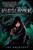
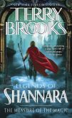
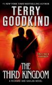
1 – DEFINITIVE CHARACTER SHOT (single figure, close-up to medium shot)
![]()
![]()
![]()
![]()
![]()


PROS & CONS
+ clear, definitive view of character
+ simple and uncluttered (good for thumbnail)
+ can include action and dramatic hooks
– leaves little of character’s appearance to imagination
– defines race*
*I suspect covers that don’t define the race of the main character–that leave race ambiguous–may appeal to a wider readership.
2) OPEN-ENDED CHARACTER SILHOUETTE OR BACK VIEW (medium shot)
![]()
![]()
![]()
![]()
![]()
![]()
![]()


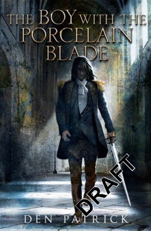
PROS & CONS
+ some setting, fairly simple, high contrast good for thumbnail
+ leaves character appearance and race to imagination
+ can have action and dramatic hooks
– absence of face / fewer details of appearance may provide fewer emotional hooks
3) OTHERWORLDLY LANDSCAPE (long shot, optional lonely figure(s) in foreground)

![]()
![]()
![]()
![]()
![]()

PROS & CONS
+ inspires dreams of fantasy setting, defines nothing of character appearance
– provides no emotional hook via characters, action or drama
4) ICON COVER (thematic emblem only )
![]()
![]()


PROS & CONS
+ defines nothing of character appearance or even setting — the true black box cover
– provides no emotional hook via characters, action, drama, or setting
HAVE THOUGHTS ON THIS?
Leave a comment below! : )

Hi Steve. I personally prefer either the icon cover, or the otherworldly landscape cover. My dad’s mocking me as I write this “could you ask him to incorporate a dodo in the cover, and ask for the family discount?” so I’m having trouble keeping a strait face. This is actually happening. Seriously though, that is actually my opinion. I like the icon covers and landscape covers, and my mom says she likes covers with no characters. “I prefer a more abstracted character…” Congratulations on all your awards and best of luck in the publishing world! -Isabel
Hi, Isabel! Kathryn says she totally agrees with you and your mom. She also says your dad is, “a goon.” : )
What would you say to a fantastical landscape with tiny but clearly silhouetted figures in the foreground, swords drawn and say, fleeing some unseen foe? Sort of like the tiny figures on the bridge on the cover of Wizards First Rule (shown above) only with figures just large enough and clear enough to be seen in thumbnail.